
Mathophobes beware! Do not read any further! I love working with data. I love to run my hands through a jumbled mass of numbers and discover the story hidden within. I’m fond of tables and charts, and data visualization. One of my favorite non-fiction books is Edward Tufte‘s The Visual Display of Quantitative Information, and I aspire to someday create a graphic as full of information and as easy to understand as Charles Joseph Minard‘s Flow Map of Napoleon’s Russian Campaign. If you cannot relate to this, you probably want to skip this post.
| GEEK LINE DO NOT CROSS GEEK LINE DO NOT CROSS |
Most diets require you to count things, usually calories or fat grams, or avoid things, such as fat or carbohydrates. The DASH diet is no different. The main things to avoid are sodium and the wrong kinds of fats, and the main things to count are servings. The servings are divided among different food groups, and the number of servings in each food group are dependent on how many calories you are aiming for each day. Although I make it a point to count calories and sodium as well as servings, I believe that the thinking behind the DASH diet is that if you just follow the guidelines for the number of servings in each food group (and don’t add salt and avoid bad fatty foods) you will end up getting the right amount of calories and sodium, as well as other important nutrients (proteins, calcium, potassium, etc.).
The NIH DASH web site proposes the following numbers of servings per day, by daily calorie target:
| Number of Servings (per day unless otherwise noted) |
Target Calories per Day |
|||
|
Food Group |
1600 |
2000 |
2600 |
3100 |
|
Grains |
6 |
6-8 |
10-11 |
12-13 |
|
Vegetables |
3-4 |
4-5 |
5-6 |
6 |
|
Fruits |
4 |
4-5 |
5-6 |
6 |
|
Fat-free or lowfat milk and milk products |
2-3 |
2-3 |
3 |
3-4 |
|
Lean meats, poultry, and fish |
3-6 |
6 or less |
6 |
6-9 |
|
Nuts, seeds, and legumes |
3 per week |
4-5 per week |
1 |
1 |
|
Fats and oils |
2 |
2-3 |
3 |
4 |
|
Sweets and added sugars |
0 |
5 or less per week |
less than 2 |
less than 2 |
I converted these numbers into a percentage of the total number of servings for this pie chart of the “ideal” DASH diet servings:
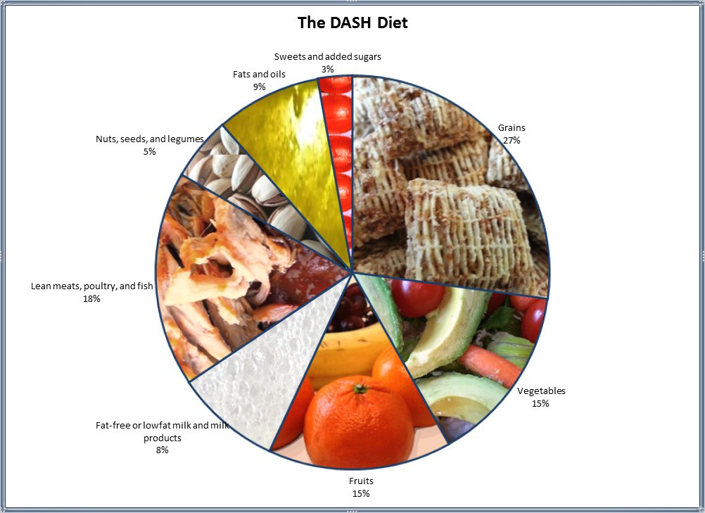
I should apologize to Edward Tufte for including pie charts in the same post where I mentioned him. Not only is he not fond of pie charts in general, but this one would likely make him really cringe because not only am I mixing apples and oranges in the same chart (the same slice even), but apples and oils. And the units are rather abstract: we are not talking about weight, volume, or even calories, but servings — one apple is a single serving of fruit whereas one tablespoon of olive oil is one serving of fats and oils. Very different beasts, and putting them together in one pie chart is probably a crime against statistics.
All I can say in my defense is that it serves my purpose. I maintain a spreadsheet of everything I eat, by food group. I have similar pie charts that show how my servings have been tracking for the past week and for the year to date. A quick look at the three pie charts lets me gauge at a glance whether I need to focus on doing better with any one food group. For example, I saw that I was not balancing fruits and vegetables well enough: too many vegetable servings, not enough fruits. So I worked on eating more fruits and now my fruits make up exactly 15% of my diet.
Now I need to work on more grains and less meat and vegetables… Ooh! I found a recipe for scones today, I wonder if I can adapt it to use whole grains and less butter, and still have it taste good… Hmmm…
Françoise
